ORA Pilates, studio website concept study
01 · The brief
The problem to solve
Fitness sites shout schedules. ORA breathes like the practice.
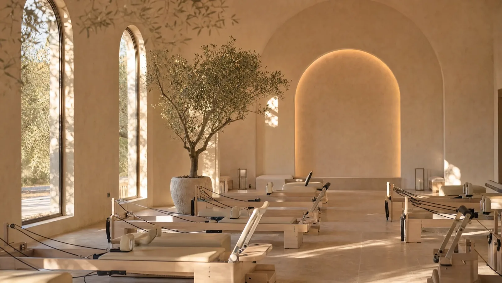
Boutique fitness websites default to urgency: class grids, countdown offers, neon CTAs. Pilates is the opposite of urgency. ORA's whole product is control, breath, and pace, and a site that shouted would contradict the thing it was selling. Our own brief: make the website feel the way a studio feels at 7 a.m., light coming through the windows.
02 · The idea
The page is a day
The site is built on a single conceit: the page is a day. Scrolling moves you through a session the way a member experiences one, from arrival through warmth and practice to stillness, with the light, palette, and pacing shifting section by section. Content isn't listed; it's sequenced.
The type and color system stays soft without going vague: warm neutrals, a single grounding dark, generous negative space that acts like the pause between movements. Scroll choreography is slow and deliberate, and every animation respects reduced-motion settings. Calm shouldn't be conditional.
Behind the calm, the mechanics are sharp: a fast single-page build, clean semantics, and local search structure for the classes-near-me queries a studio actually wins on.
03 · The study
Scope & record
Next in the archive: Longhand, or the full archive.
04 · Contact
The next case study
Your business, presented properly.
ORA is a concept study; the pacing, restraint, and local search structure in it are what a real studio would get. Twenty minutes, no pitch deck: tell us where the business is going, and we'll tell you if we can get you there.
contact@getempiredesigns.com / (315) 542-8942